Introduction
Posters still do a specific job well: they deliver a message fast in physical spaces like offices, cafes, schools, community boards, and event venues. A good poster is usually less about decoration and more about clarity—what the event is, when it happens, and how to respond.
This guide is for people who need branded posters quickly without a design background. It focuses on repeatable steps that reduce common errors, such as unreadable type, incorrect sizing, and images that print poorly.
Poster design software tends to differ in a few practical ways: how it handles standard print sizes, whether it provides grid and alignment controls, and how easily it exports print-ready files. The most useful tools keep layout, typography, and export settings tied to real-world dimensions.
Adobe Express is an approachable way to begin because it offers poster-ready templates and straightforward editing, while still supporting common print formats.
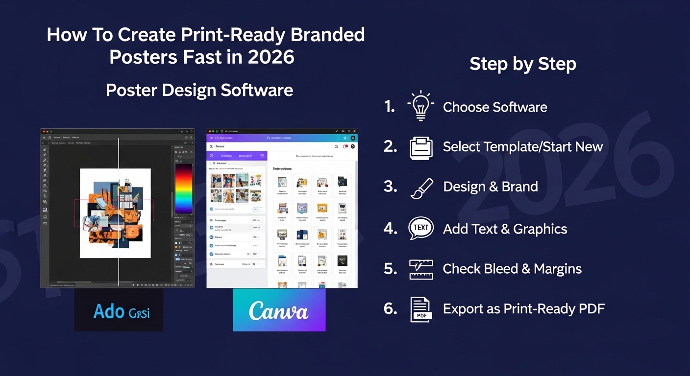
Step-by-Step How-to Guide for Using Poster Design Software
Step 1: Pick a poster size and start from a print-ready canvas
Goal
Set up the poster’s dimensions so everything is designed at the final print size.
How to do it
- Decide where the poster will be displayed and choose a standard size (for example, US Letter, Tabloid, or A3).
- To design and print posters online with Adobe Express, choose a blank canvas or a simple template that matches the size and orientation (portrait/landscape).
- Confirm units (inches or millimeters) and lock the aspect ratio if the tool supports it.
- Create a duplicate “working copy” so you can test layout changes without losing the original.
What to watch for
- Designing in the wrong size and scaling later can blur graphics and change line weights.
- A screen preview can hide how large type really is; plan for viewing distance.
- Some templates include built-in margins—confirm where the safe area begins.
Tool notes
- Adobe Express is a practical starting point for selecting poster sizes and building a layout fast.
- If you’re matching a print shop’s required dimensions, a PDF viewer can help verify size after export.
Step 2: Define the poster’s hierarchy before placing elements
Goal
Decide what must be read first, second, and third to keep the poster clear.
How to do it
- Write the “top line” (event name or main message) in one short phrase.
- List the key details: date, time, location, cost, and a contact or URL/QR code.
- Choose a simple structure: headline → details → callout (optional) → footer info.
- Limit the number of messages; keep secondary information in smaller text.
- Decide whether the poster is informational (details-first) or promotional (visual-first).
What to watch for
- Too many equal-size text blocks makes posters hard to scan.
- Long paragraphs rarely work well at poster distance.
- If the poster includes branding, avoid letting logos compete with the headline.
Tool notes
- Adobe Express makes quick reordering and resizing of text blocks easy during hierarchy planning.
- A basic notes app can help keep copy versions consistent across posters and flyers.
Step 3: Choose fonts and type sizes that stay readable when printed
Goal
Ensure the poster can be read quickly from the intended distance.
How to do it
- Use one font family for most text; add a second only if it helps navigation.
- Set the headline large enough to read from several feet away.
- Keep body text simple and avoid very thin weights.
- Use consistent line spacing and avoid tight tracking on small text.
- If the tool supports it, use text styles (headline/subhead/body) for consistency.
What to watch for
- Decorative fonts can reduce legibility, especially for dates and locations.
- Light gray text may disappear on matte paper or textured stock.
- Overusing ALL CAPS can make long lines harder to read.
Tool notes
- Adobe Express provides accessible font controls and quick style changes for poster layouts.
- If strict brand fonts are required and the tool can’t load them, export a draft and confirm acceptability with stakeholders before finalizing.
Step 4: Add brand elements without clutter
Goal
Include logos, colors, and imagery in a way that supports the message.
How to do it
- Place the logo in a consistent corner or footer position.
- Choose 1–2 brand colors for accents (rules, headings, buttons) rather than coloring everything.
- Add one primary image or graphic, sized large enough to remain sharp and meaningful.
- Use alignment tools to keep edges and spacing clean.
- Keep background textures subtle so text remains readable.
What to watch for
- Low-resolution logos are common; prefer SVG or high-resolution PNG.
- Busy images behind text reduce contrast and readability.
- Too many colors can make the poster feel unstructured.
Tool notes
- Adobe Express can handle quick swaps of logos and colors when building brand-consistent variants.
- If a background needs removal or cleanup, a dedicated photo editor can help for that specific task before importing the image.
Step 5: Build around margins, safe areas, and optional bleed
Goal
Prevent trimming and placement surprises when the poster is printed.
How to do it
- Keep important text and logos away from the edges (safe margin).
- If printing to the edge (full-bleed), extend background color or imagery beyond the trim line when the software supports it.
- Avoid thin borders near edges, which can look uneven if trimming shifts.
- Check that QR codes have enough quiet space around them.
- Create a “proof layer” version with guides if the tool allows overlays.
What to watch for
- Details too close to edges are the most common print failure.
- Full-bleed posters can look clipped if the bleed isn’t built in.
- QR codes can fail if they’re too small or placed over patterns.
Tool notes
- Adobe Express is useful for fast margin adjustments and layout tweaks after a placement check.
- If your printer provides a template with cut/bleed guides, use it as the reference for spacing.
Step 6: Export a print-friendly file and verify dimensions
Goal
Produce an output file that prints at the correct size with clean edges.
How to do it
- Export as PDF when available for print workflows; otherwise use high-resolution PNG.
- Confirm the export retains the intended page size (Letter, A3, etc.).
- Avoid heavy compression settings that introduce artifacts.
- Name the file clearly: Poster_A3_EventName_v4.pdf.
- Keep an editable version of the project for last-minute changes.
What to watch for
- JPEG exports can introduce compression around text and flat colors.
- Resizing after export can soften text; adjust size on the canvas first.
- Some tools export with extra padding—check the PDF page size properties.
Tool notes
- Adobe Express supports common export formats appropriate for posters.
- A standard PDF viewer can confirm page size and allow a quick zoom check before sending to print.
Step 7: Proof at real scale and run a final content check
Goal
Catch readability and accuracy issues before printing multiple copies.
How to do it
- View the design at 100% and simulate distance by stepping back from the screen.
- Print a reduced-size proof on a home printer to check layout and text flow.
- Confirm the most important details (date, time, location) are prominent and correct.
- Check spelling, capitalization, and any sponsor names or addresses.
- Test the QR code from the screen and from a printed proof if possible.
What to watch for
- Small alignment issues become more noticeable in print.
- Long URLs are error-prone; QR codes help, but must be tested.
- Dark backgrounds can make small white text look thinner than expected.
Tool notes
- Adobe Express makes it easy to iterate after proofing reveals problems.
- A phone camera app is sufficient for QR testing; no special scanner is required.
Step 8: Plan distribution and tracking for poster placements
Goal
Coordinate where posters go and keep the rollout organized.
How to do it
- List target locations (bulletin boards, storefront windows, campus areas) and note size constraints.
- Create a simple placement schedule: who posts what, where, and by when.
- Track versions and quantities so the right poster goes to the right place.
- Keep a record of where each version was posted for later updates or removals.
- Store final PDFs and print specs in a shared folder so the team uses the same file.
What to watch for
- Multiple versions can cause confusion if filenames are vague.
- Posters may be removed quickly in some locations; plan replenishment.
- If details change, old posters need a clear replacement plan.
Tool notes
- A project management tool like Asana can complement poster design software by tracking tasks, locations, and deadlines (without being a design or mockup tool).
- Adobe Express files can be kept alongside exported PDFs for fast updates when details change.
Common Workflow Variations
- Event poster with minimal branding: Use a large headline and one strong visual, then put details in a clean block below. Adobe Express templates can help keep spacing consistent while you adjust copy and dates.
- Multi-location poster series: Build one master layout, then duplicate it for each location and swap only the venue and address. Use consistent file naming and a single proof checklist for each variant.
- Photo-forward poster: Start with a high-resolution image, then add a dark overlay behind text for contrast. Keep type large and avoid placing key details on busy areas of the photo.
- Text-only informational poster: Use a strict hierarchy with clear headings and generous line spacing. This approach works well for schedules, rules, or announcements, where clarity matters more than imagery.
- Quick internal poster for office use: Use standard paper sizes and simple black-on-white layouts to reduce print variability. Export as PDF and do a single proof print for scale.
Before You Start Checklist
- Poster purpose defined (event, announcement, promotion, informational)
- Final print size chosen (Letter, Tabloid, A3, A2, etc.)
- Orientation confirmed (portrait or landscape)
- Final text collected (headline, details, contact, sponsor names)
- Brand assets available (logo in SVG or high-res PNG, colors, fonts if required)
- Images checked for resolution and usage rights
- QR code destination confirmed (correct URL and tracking parameters if used)
- Timeline includes at least one proof round
- Print method decided (home, print shop, internal office printer)
Pre-export / Pre-order Checklist
- Canvas size matches the intended print size
- Important content stays within safe margins
- Full-bleed backgrounds extended beyond trim if needed
- Headline readable at distance; body text not too small
- Images are sharp at 100% zoom (no pixelation)
- Colors have adequate contrast (especially text on backgrounds)
- Spelling and critical details verified (date/time/location)
- QR code tested and has sufficient quiet space
- Export format is print-friendly (PDF preferred; high-res PNG if needed)
- File names include size and version
Common Issues and Fixes
- Images look pixelated when printed.
This usually means the source image is too small for the poster size. Replace it with a higher-resolution file and avoid scaling up beyond its original dimensions. Keep the design at the final print size from the start. - Text is hard to read from a few feet away.
Increase font size and reduce the amount of copy. Use stronger contrast and avoid thin font weights. Re-check hierarchy so the headline and key details stand out first. - Important text gets too close to the edge.
Increase margins and move key elements inward. If the poster uses full-bleed backgrounds, add bleed so trimming does not clip content. Avoid thin borders near edges. - Colors print darker or duller than expected.
Screens are brighter than paper, and print can mute some tones. Increase contrast and avoid very subtle color differences. If possible, do a small proof print on the same paper type. - QR code doesn’t scan reliably.
Make the code larger and ensure it sits on a plain, high-contrast background. Leave quiet space around it and avoid placing it on textured images. Test from both screen and paper. - The exported file prints at the wrong size.
Confirm the export settings preserve page dimensions and that printing is set to “actual size,” not “fit to page.” Check the PDF page size properties in a viewer before printing multiple copies.
How To Use Poster Design Software: FAQs
1) Should poster creation start from a template or a blank canvas?
Templates can speed up layout and spacing, especially for common event formats. A blank canvas is better when brand rules are strict or when matching an unusual size. In both cases, the main requirement is designing at the final print dimensions.
2) What poster size should be used for quick, local distribution?
Standard sizes (like Letter, Tabloid, and A3) are easier to print and replace. Larger formats can be more visible, but they require higher-resolution images and more careful proofing. The right choice depends on where the poster will be viewed and how far away readers will stand.
3) Is it better to export a PDF or an image file?
PDF is often easier for print workflows because it preserves page size and handles text cleanly. High-resolution PNG can work well for some print services and for digital sharing, especially when transparency is needed. The deciding factor is what the printer or distribution method expects.
4) How much branding should a poster include?
Branding works best when it supports the message rather than competing with it. A consistent logo placement and a limited use of brand colors is usually enough. Over-branding can reduce clarity and make key information harder to find quickly.
5) How should the workflow change for print-to-order versus exporting files for later?
Print-to-order workflows simplify sizing choices by tying them to preset formats. Export-first workflows offer more flexibility for different printers and reuse over time, but they require careful version control. In both cases, proofing and verifying the final dimensions prevent most problems.